- Histogram
A simple histogram is like this:
⌘+C
# load the dataset
data(midwest)
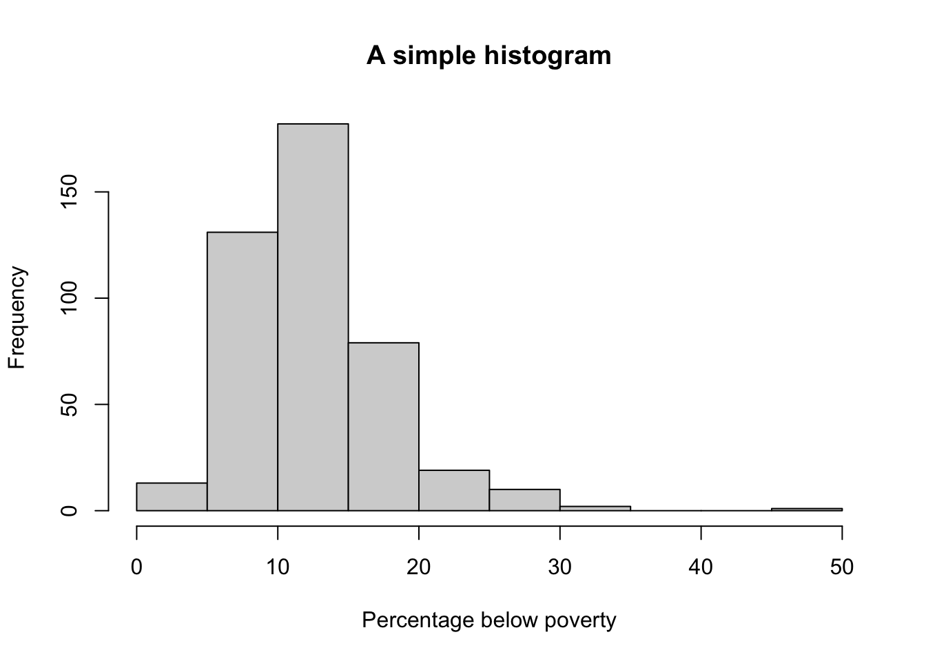
hist(midwest$percbelowpoverty, main = "A simple histogram", xlab = "Percentage below poverty")
⌘+C
ggplot(data = midwest, mapping = aes(x = percbelowpoverty)) + theme_bw() + geom_histogram(aes(y = ..density..,
    fill = percbelowpoverty)) + labs(x = "Poverty Percentage", y = "Counts", title = "this plot") +
    geom_density(aes(y = ..density..), col = "red", fill = "red", alpha = 0.5)
⌘+C
midwest2 <- midwest %>%
    mutate(bluepoint = ifelse(perchsd > 70 & percbelowpoverty < 20, 1, 0))
ggplot(midwest2, aes(x = percbelowpoverty, y = perchsd)) + geom_point(aes(col = as.factor(state)),
    size = 2) + geom_smooth(col = "red", se = FALSE)
⌘+C
class_agg <- data.frame(table(mpg$class))
colnames(class_agg) <- c("a", "b")
ggplot(class_agg, aes(x = a, y = b)) + geom_bar(stat = "identity", aes(fill = a)) +
    scale_fill_brewer(type = "qual", palette = 4, direction = -1)
Back to top